In today’s world, rebranding has become a trend. For businesses, that means modernizing and transforming visual aspects of your company – anything from revamping your logo or catch phrase to changing up your marketing tactics and content strategy.
Branding sets your business apart from competitors and allows customers to develop a connection and loyalty to you. Modernizing your branding techniques can actually benefit your school or studio in many ways, including:
- expanding your target market
- keeping your business current
- boosting brand loyalty
If you’re on the fence about whether or not to change things up, here are four signs it’s time:
1. You Don’t Like to Show Off Your Company
Branding is all about evolution. Deciding to rebrand doesn’t mean that you hate your old image – some designs and styles just work better in different times. Think of it as an upgrade! You want to be confident with your facility’s image. Play around with new fonts, color shades, and shapes while still keeping the integrity of your brand and core values.
Tip: It’s important to note that when you rebrand, it should be a big deal. Promote the change on social media, to your current members, and create new merchandise!
2. Your Facility Has Changed and You’ve Outgrown Your Look
Most schools and studios typically start outgrowing their original branding style due to expansion of products or adjusting the services offered. An example would be changing your school’s logo when new programs are added or if your school/studio has relocated.
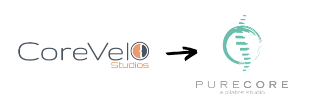
Current Market Muscles client PureCore recently went through a complete rebrand that included changing their name, logo, and colors. PureCore’s original name, CoreVelo, encompassed elements of both their Pilates and cycling programs. When the studio’s focus shifted to solely Pilates, a rebrand was necessary.
The new name, PureCore, was fitting for a Pilates practice, which focuses on building core strength. PureCore’s updated colors, teal and light gray, were calm and soothing – a stark contrast to CoreVelo’s branding which used bright orange and dark gray – very high energy colors.
3. Your Design Is too Detailed
When it comes to creating a logo, you want to make sure that it’s eye-catching, memorable, and unique. As a fitness facility, you want a logo that evokes pride and makes people feel good about themselves. The best way to do this is through geometric shapes and basic colors. A good rule of thumb is: Keep it simple. Avoid overdoing it with a million different different icons and intricate designs. Think about creating a logo that has three main components: brand name, tagline and icon.
Designing the perfect logo for your company can be hard, so here are a few tips to get you started:
- Define Your Audience
- Identify Your Brand’s Personality
- Research Competing Companies
- Choose Your Font(s)
- Choose Your Color(s)
4 .You’ve Never Rebranded
You may think it’s too late to update or change your school’s logo or colors. However, some of the most known companies around the world prove this to be wrong. Think of your favorite brand. Now think of their logo. It is most likely that the logo has been evolved in some way over the past 5 years (maybe it’s even gone through multiple rebrandings).
Check out a few examples ????
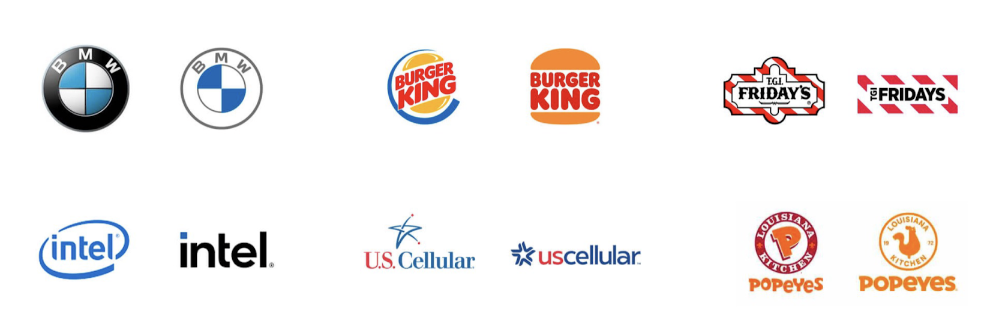
You want your logo to be current – an outdated or unappealing logo can have a negative impact on your business!
60% of consumers avoid brands that have odd, unattractive, or unappealing logos, regardless if they received good reviews. – Study Finds, 2020
Strong branding is a key aspect of any business. Market Muscles is here to help strengthen your company’s branding through modern websites designed to attract new leads – schedule a call with us to learn more!