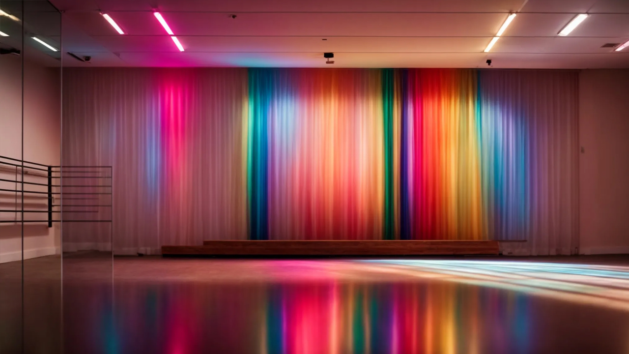
Exploring the Color Theory in Dance Studio Website DesignWhen stepping into a dance studio, the explosion of colors often mirrors the dynamism and energy of dance itself, setting the mood and inspiring the dancers.This same principle applies to the design of dance studio websites, where color not only enhances aesthetics but also influences how visitors feel and interact with the content.By understanding and applying color theory, studio owners can create an online space that perfectly encapsulates the spirit of their studio.Selecting the right color palette can convey motion, emotion, and artistry, making the website a digital extension of the dance floor.In this article, we’ll explore how to harness the power of color in web design specifically tailored for dance studios, ensuring your website stands out and speaks directly to the hearts of your audience.Understanding the Impact of Colors on Dance Studio WebsitesColors wield significant power within the digital realm, transforming mere online spaces into vibrant, emotion-stirring experiences, particularly for a dance studio’s website.This fusion of hue, brightness, and contrast does more than captivate the eye; it lays the foundation for a dance studio’s brand, setting the stage for its online identity.By meticulously selecting a palette that resonates with the energy and style of their dance genres, studios can craft a website audit services that not only appeals visually but also communicates the essence of their brand.This strategic use of color not only draws potential clients in but also aids in forging a deeper, more meaningful connection with the studio’s community.Hence, understanding the role of colors extends beyond aesthetics; it becomes a tool for enhancing website appeal and cementing a studio’s brand in the hearts and minds of its audience.How Colors Can Enhance Your Website’s AppealThe strategic incorporation of colors in dance studio web design does wonders for user engagement. From the tranquil shades of blue that evoke a sense of calm to the vibrant yellows that radiate optimism, each color chosen contributes to a user’s emotional journey, steering them closer to a studio’s ethos.Colors serve as silent storytellers, subtly guiding visitors through the website’s narrative. A thoughtfully designed color scheme, by appealing to visual perception, not only boosts the site’s aesthetics but significantly impacts usability. This careful blend of art and science ensures that navigating the website is not just intuitive but a visually enriching experience.The Role of Colors in Branding for Dance StudiosThe selection of colors in a dance studio’s website goes beyond mere decoration, embedding itself deeply in the psychology of branding. By choosing hues that align with their message and values, studios can forge a unique identity that stands out in the crowded digital landscape, attracting the right audience and engaging them on a level that is both intuitive and emotional.Effective color choices can turn a studio’s brand into a symbol of trust and quality. For instance, incorporating shades of purple might communicate creativity and luxury, while earth tones could evoke feelings of warmth and stability, making the studio seem more approachable. This subtle yet powerful use of color psychology not only differentiates a brand but also influences perceptions, encouraging a stronger bond between the studio and its community.The Basics of Color Theory for Dance Studio Web DesignDelving into the world of color theory is a journey that unlocks the potential to elevate a dance studio’s website from good to unforgettable.It starts with mastering the color wheel, this fundamental tool that lays out the relationship between colors, enabling designers to weave palettes that range from harmonious to dynamically contrasting.Beyond its visual appeal, color directly affects the psychological state of website visitors.Choices in hue, saturation, and brightness carry the power to evoke emotions, shape perceptions, and ultimately, influence behavior.In the context of a dance studio, selecting the right colors can mirror the energy of its classes, inspire confidence in its offerings, and ignite a sense of community amongst its members.Understanding the Color WheelThe color wheel emerges as an indispensable tool in the realm of dance studio website design, offering a visual map of hues that helps creators forge compelling, cohesive color schemes. This circular diagram elegantly illustrates the relationships between primary, secondary, and tertiary colors, guiding designers in their selection process to ensure the site exudes the desired atmosphere.By tapping into the science behind the color wheel, designers uncover the secrets of creating harmony and contrast within a dance studio’s digital presence. For example, leveraging complementary colors or choosing analogous schemes can dramatically affect the site’s mood and user experience, making the color wheel an essential ally in crafting visually appealing and emotionally resonant online spaces.The Psychological Impact of Color ChoicesThe psychological impact of color choices on a dance studio’s website design cannot be understated. Colors have the innate ability to evoke specific emotions and feelings within an individual, influencing their perception and interaction with the website. For instance, the energetic vibes of orange can instill a sense of excitement and enthusiasm, while the calmness of green might encourage feelings of balance and renewal.This emotional connectivity fostered by thoughtful color selections not only enhances the user experience but also bolsters the branding of the dance studio. A website that strategically employs colors to match the studio’s ethos and style of dance can create a memorable impression, encouraging visitors to associate certain feelings with the brand. This deep psychological influence shapes the visitor’s understanding and relationship with the studio, making color choices a powerful tool in website design.Selecting the Perfect Color Palette for Your Dance StudioIdentifying the ideal color palette for a dance studio’s website demands a careful balance between analyzing target audience preferences and seamlessly weaving the brand’s identity into color choices.This process involves a deep dive into understanding the demographics and emotional triggers of potential clients, aligning them with the studio’s ethos to create a visually appealing and emotionally resonant online space.By considering the psychology behind color perception and its influence on human behavior, studios can craft a website that not only attracts the eye but speaks directly to the hearts of its visitors, fostering a sense of belonging and motivation.The journey towards selecting the perfect color palette becomes a strategic endeavor to ensure every shade and tint represents the studio’s spirit and connects with the audience on a profound level.Analyzing Target Audience PreferencesAnalyzing target audience preferences is a vital step in selecting the perfect color palette for a dance studio website. It involves a close look at the demographic details such as age, gender, and cultural background of the studio’s potential clients, as these elements can dramatically influence color perception and preferences.Understanding the emotional triggers and expectations of the studio’s audience informs color choices, ensuring the palette resonates with visitors on a deeper level. This approach tailors the visual experience to match not just the identity of the studio, but also the nuances and preferences of those it seeks to engage.Integrating Brand Identity With Color ChoicesIntegrating brand identity with color choices is a nuanced art that requires a dance studio to reflect its fundamental character and values within its visual presentation. Through careful selection of shades and tints, the website can embody the energy, style, and ethos the studio stands for, forging a distinct and memorable online identity. This alignment between visual language and brand essence not only captures attention but also fosters a sense of authenticity and trust among visitors.A dance studio’s brand identity is mirrored in the colors it adopts, weaving a narrative that speaks directly to viewers even before they engage with the content. Colors like vibrant magenta for dynamism or serene cyan for tranquility can subtly indicate the type of dance focus the studio emphasizes, creating an immediate, intuitive connection with the right audience. By translating the studio’s core message into a visually compelling palette, designers unlock a powerful tool in crafting a cohesive, impactful digital presence.The Psychology Behind Color Choices in Dance StudiosWithin the realm of dance studio website design, the strategic application of color theory wields the power to subtly influence a visitor’s decision-making process, particularly in matters of enrollment.The psychological nuances of color choices play a pivotal role in shaping the studio’s digital atmosphere, convincingly steering potential clients towards engaging with the studio’s offerings.By utilizing colors that either spark passion or promote relaxation, studios can effectively align their visual communication with the emotional and psychological state they wish to evoke in their audience, thereby enhancing the likelihood of converting website visitors into enrolled students.Encouraging Enrollment Through Color PsychologyThe subtle art of leveraging color psychology in a dance studio’s website design can significantly drive enrollment rates by tapping into the emotional resonance of potential clients. Colors that embody the spirit of the studio’s dance forms, like the fiery reds for Latin dances or the tranquil blues for ballet, create an instant emotional connection, encouraging visitors to take the next step and enroll.By strategically selecting colors that align with the desired emotional response, dance studios can craft a website that not only stands out visually but also persuades visitors on a psychological level. This deliberate choice ensures that every hue and shade contributes to a cohesive message of inspiration, confidence, and belonging, making the decision to enroll feel both natural and exciting for prospective students.Colors That Invoke Passion Versus Relaxation in DanceIn the world of dance studio website design, the choice between colors that invoke passion versus those that promote relaxation is crucial. Fiery reds and vibrant oranges are often employed to stir the spirit, inviting a surge of energy and dynamism that resonates with more lively dance genres like salsa or hip-hop. These colors captivate the viewer, emitting a sense of urgency and excitement that can motivate them to explore further or even sign up for classes.Conversely, soothing blues and gentle greens are masterfully used to inspire a sense of calm and tranquility, perfect for studios that specialize in ballet or contemporary dances. These colors create a serene digital environment, encouraging visitors to feel at ease and in harmony with the studio’s ethos. Such a tranquil color palette can greatly influence a visitor’s decision, making them feel more connected to the studio’s vibe and more likely to become a part of its community.How to Use Color Contrasts to Highlight Key Website ElementsMastering the use of color contrasts in dance studio website design is essential for drawing attention to critical elements, ensuring they don’t just blend into the background but stand out, compelling the visitor’s engagement.This technique involves pinpointing specific features like call-to-action buttons, menu options, or important announcements that require immediate visibility.By selecting contrasting colors, designers can create a visual hierarchy that not only enhances the site’s overall aesthetics but also improves its functionality.The result is a user-friendly interface that gracefully guides visitors through the website, making their journey both intuitive and visually stimulating.Identifying Elements That Need EmphasisIn the intricate dance of web design for dance studios, pinpointing elements that demand emphasis is akin to choreographing a standout performance. Key features such as signup forms, class schedules, and special announcements bear the weight of capturing visitor interest and should be highlighted distinctly. Selecting contrasting colors for these elements ensures they cut through the visual noise, grabbing attention at the rightful moments.The creative application of color contrasts elevates the user interface, making navigation an effortless affair for visitors. By carefully choosing hues that stand out against the website’s overall color scheme, designers can spotlight elements like the contact page or promotional offers. This not only improves readability but also accentuates the studio’s call to action, subtly guiding potential students towards making that decisive click.Choosing Contrasting Colors for Visibility and AestheticsOpting for contrasting colors within a dance studio’s website design serves as a pivotal strategy for enhancing both visibility and aesthetics. The choice is critical; it dictates how effectively a visitor’s attention is directed towards key elements like registration buttons or membership information, ensuring these features are immediately noticeable against the site’s broader color scheme.This deliberate selection of contrasting hues not only highlights essential website components but also contributes to the overall beauty of the page layout. Designers can create a compelling visual narrative that harmonizes with the studio’s brand and values, ultimately making the site more inviting and user-friendly.Integrating Multimedia Elements With Your Website’s Color SchemeThe interplay between a website’s color scheme and its multimedia elements is a critical facet of design that can significantly enhance or diminish the user experience.This synergy extends beyond mere aesthetics, acting as a visual cue that guides visitors’ emotions and engagement levels.By matching video and image content to the overarching color theme, dance studios can create a seamless, immersive experience that resonates with the viewer’s expectations.Furthermore, the strategic use of colors within these multimedia aspects can amplify the user’s experience, making the journey through the website more intuitive and emotionally compelling.This approach not only reinforces the brand identity but also plays a crucial role in crafting an online space that is both cohesive and captivating.Matching Video and Image Content to Your Color ThemeWhen incorporating video and image content into a dance studio’s website, ensuring these elements align with the site’s color theme is essential. This alignment enhances the visual harmony across the platform, creating a more immersive and engaging user experience. By carefully selecting multimedia content that echoes the primary and secondary colors of the website, designers can significantly amplify the brand voice and identity.Choosing media that complements the website’s color palette does more than just beautify the space; it acts as a thematic thread that binds the website’s content cohesively. This strategic approach aids in guiding the viewer’s emotions, subtly reinforcing the mood and atmosphere that the dance studio seeks to convey. As a result, visitors are more likely to feel a deeper connection with the studio’s brand, encouraging them to explore further and potentially enroll in classes.Using Colors to Enhance Multimedia User ExperienceApplying a thoughtful selection of colors in multimedia elements drastically elevates a user’s journey on a dance studio’s website. It ensures that videos and images not only mirror the site’s aesthetic but actively contribute to a more engaging and coherent experience. This method positions color as a silent guide, leading eyes and emotions through the visual content with purpose and grace.Moreover, by harnessing the power of color to underscore key multimedia messages, dance studios amplify the impact of their online presence. When colors are precisely chosen to complement both the website’s theme and the embedded media, they strengthen the narrative being told, making every interaction on the site more memorable and persuasive to the viewer.Case Studies: Successful Color Schemes in Dance Studio WebsitesIn the vibrant world of dance studio website design, understanding the impact of color schemes on viewer engagement and brand identity is crucial.The following subsection delves into real-world applications, presenting case studies of successful color strategies employed by leading studios.It explores the underlying reasons for their effectiveness, offering a rich source of inspiration drawn from the best in the industry.This exploration sheds light on how precisely chosen color schemes can transform a website, turning it into an emotive and engaging online presence that resonates with its target audience.Analyzing What Works and WhyIn the realm of dance studio website design, the strategic application of color theory stands out as a pivotal factor in crafting engaging digital environments. A deep dive into successful case studies reveals that those studios which effectively harmonize their color schemes with the emotional tone of their classes tend to create resonant and memorable online spaces. This correlation underscores the importance of intentional color choices in establishing an immediate, emotional connection with potential students.Moreover, analyzing successful dance studio websites, we observe a trend where color contrasts and complements are deftly utilized to highlight calls to action, such as class registrations or event announcements. This not only enhances the functionality and user experience of the website but also subtly guides the visitor’s journey towards engagement and conversion. The success of these color schemes confirms that when the principles of color theory are expertly applied, they significantly contribute to the studio’s online visibility and perceived value.Inspiration From the Best in the IndustryDrawing inspiration from industry leaders, it’s evident that dance studios with the most compelling websites often embrace a color scheme that reflects the vivacity and spirit of dance itself. These pioneers leverage a sophisticated understanding of color theory, using it to tell a story that captures the essence of movement and rhythm, setting them apart from the competition.Among these successful examples, utilization of warm tones like vibrant oranges and fiery reds to communicate passion, juxtaposed with cool blues and greens for balance and tranquility, showcases a masterful approach to visual communication. This strategic color placement reinforces the studio’s brand as dynamic and welcoming, inviting visitors to explore deeper and connect on an emotional level.Implementing Your Color Scheme With Web Design Best PracticesIn the layered process of dance studio website design, the employment of an effective color scheme is more than just an artistic choice—it’s a strategic one.With the correct tools and resources, designers can navigate through the vast spectrum of colors to pinpoint those that will best encapsulate the studio’s essence and communicate its unique message.This task involves rigorous testing and refinement of the website’s color palette, a critical step towards ensuring that the visual experience not only aligns with the studio’s identity but also enhances the user interface for optimal visitor engagement.This approach underscores the importance of integrating your color choices with web design best practices, laying the groundwork for a website that is both aesthetically pleasing and functionally superior.Tools and Resources for Color Scheme SelectionFor dance studio website designers aiming to implement color schemes effectively, selecting the right tools and resources is crucial. Adobe Color is a highly regarded tool that offers a digital color wheel, enabling designers to experiment with different color combinations and harmonies, tailoring the website’s palette to echo the vibrancy and energy of the dance studio’s brand.Another valuable resource is the Coolors app, a user-friendly interface that simplifies the creation of color schemes by generating palettes from uploaded images. This can be especially useful for dance studios looking to align their website color scheme with their logo or existing branding materials, ensuring a cohesive and visually appealing online presence.Testing and Refining Your Website’s Color PaletteLaunching a dance studio’s website without conducting thorough color palette testing could mean missing an opportunity to deeply resonate with the audience. By deploying A/B testing, studios can present various versions of their site to different segments, closely observing which color schemes encourage more engagement and conversions. This hands-on approach reveals the nuances of human behavior and preference, guiding designers towards palette choices that elevate the user experience.Refinement of a website’s color palette doesn’t stop after initial testing. It requires ongoing analysis to adapt to changing trends and audience feedback. Utilizing analytics tools like Google Analytics can provide insights into how different color schemes affect site metrics such as time on site and bounce rate. Armed with this data, designers can make informed decisions, fine-tuning the website’s colors to perfect the balance between appeal and usability, ensuring the dance studio’s online presence remains fresh and engaging.ConclusionExploring color theory in dance studio website design is crucial for creating engaging, memorable online spaces that resonate emotionally with visitors.By intelligently selecting and applying colors, designers can enhance the aesthetic appeal, improve usability, and effectively communicate the studio’s brand identity and ethos.Colors influence perceptions and behaviors, evoking specific emotional responses that can lead to increased engagement and enrollment rates.Utilizing tools like Adobe Color and conducting rigorous testing and refinement ensures the chosen palette aligns with the studio’s spirit and appeals to its target audience.Ultimately, a strategic approach to color in web design not only distinguishes a dance studio in the digital landscape but also fosters a deeper connection with its community, making color theory an indispensable asset in the competitive realm of dance studio branding and marketing.