
Ultimate Guide to Color Theory for Dance Websites
Thoughtfully chosen color palettes on your dance studio website convey emotion, reinforce branding, elevate usability, and drive conversions—turning your site into a digital echo of your studio’s energy.
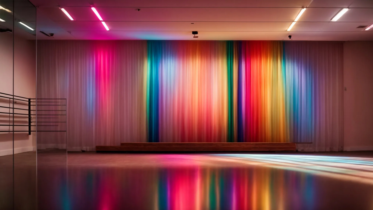
When you step into a dance studio, vivid color often mirrors movement and mood. That same principle holds true for your dance studio’s website: color shapes first impressions, guides emotions, and deepens engagement. Selecting the right palette lets your site embody the artistry and spirit of your studio.
Why Color Matters for Dance Studio Websites
Colors go beyond aesthetics—they influence emotion, perception, and behavior. For a dance studio, your site’s palette can tell your brand story before any copy or imagery does.
A studio that uses energetic reds and oranges may evoke passion and intensity, while one using soft blues and greens might feel calm, graceful, and refined. The palette you choose sends a message.
The Role of Colors in Branding & Emotion
Color selection is a powerful branding tool. Your hues should reflect your studio’s mission, class styles, and the emotional tone you want to set.
For example:
- Purple – creativity, elegance, artistry
- Earth tones – warmth, community, groundedness
- Vibrant yellow – energy, optimism, momentum
When consistent across your site, logo, and promotional materials, your color palette strengthens brand recognition and emotional resonance.
Basics of Color Theory for Web Design
Understanding the Color Wheel
The color wheel is a foundational tool for designers. It shows relationships between primary, secondary, and tertiary colors. From it you can derive:
- Complementary schemes (colors opposite each other on the wheel for strong contrast)
- Analogous schemes (colors adjacent on the wheel for harmony)
- Triadic palettes (three evenly spaced colors for balance and vibrancy)
The Psychology of Color
Colors elicit emotional and psychological responses. In a dance studio context:
- Orange and red generate excitement or intensity
- Green and blue promote calm and trust
- Soft neutrals provide balance and let accent colors shine
Choosing colors aligned with your studio’s personality helps guide visitors’ moods and decisions.
How to Choose the Right Palette
Know Your Audience
Demographics—age, gender, cultural background—and their color preferences matter. A children’s dance studio might favor bright, playful hues; a classical ballet studio may lean on muted pastels or monochromes.
Reflect Your Brand Identity
Let your mission, values, and dance styles inform your palette. If your studio specializes in contemporary dance, a modern, minimal palette with bold accents might be ideal. For ballet or lyrical styles, soft gradients or muted tones might resonate more.
Color Strategies That Drive Engagement
Invoke Passion vs. Relaxation
Match your palette’s emotional tone to your offerings. High-energy classes (e.g. jazz, hip-hop) can benefit from strong, warm colors. Delicate, flowing classes (e.g. ballet, contemporary) often suit cooler, softer tones.
Use Contrast to Highlight Key Elements
Buttons, CTAs, menus, and alerts should stand out. Use colors with enough contrast from the background to ensure accessibility and instant visibility.
For example, a call-to-action button in bright coral on a muted gray background catches the eye and prompts clicks.
Coordinate Multimedia & Visuals
Your images and videos should feel integrated—not like afterthoughts. Use filters, overlays, or color grading to align multimedia with your palette palette, creating a cohesive visual experience.
Case Studies & Real Examples
Many successful dance studios use color to mirror their energy and style. They often:
- Pair contrasting palettes to draw attention to CTAs
- Balance bold gradient headers with neutral content backgrounds
- Match their color use to class types (e.g. fiery tones for Latin, gentle tones for contemporary)
Studying these can inspire your own unique combinations.
Implementing & Refining Your Palette
Tools You Can Use
- Adobe Color – color wheel and palette generation
- Coolors – create and test palettes quickly
Test & Iterate
Use A/B testing to compare versions of your site with differing palettes. Track metrics like bounce rate, time on page, and conversion rate to see what resonates best.
Over time, review analytics and user feedback to adjust saturation, accent usage, or contrast—making your color scheme both beautiful and effective.
Conclusion
Color theory is not a superficial choice—it’s a strategic layer of your studio’s online presence. When you leverage it well, your website becomes more than a homepage; it becomes an evocative, emotional introduction to your studio.
Through intentional palette selection, alignment with brand identity, strategic contrast, and ongoing testing, your site can convey energy, artistry, and trust. Let your colors dance as beautifully online as your students do in the studio.