The Biggest Misconception About Your Website’s Purpose
TL;DR: Most martial arts and dance studio owners judge their website by how it looks. But a website isn’t an art project — it’s your hardest-working salesperson. If your site is beautiful and still isn’t producing booked intro classes and trials, it’s failing at its actual job. Design should serve performance, not replace it.
Is your website supposed to look good — or bring in students?
Ask ten studio owners what they want from a new website and nine will describe how it should look. Big action photos of the mat or the stage. A modern font. A color palette that matches the studio walls. A slick video header.
None of that is wrong. But notice what’s missing from that list: enrollments. Nobody says, “I want a website that converts 8% of visitors into leads.” And that’s the misconception — the belief that a website is a digital brochure whose purpose is to represent your studio, when its real purpose is to generate qualified leads and get people through your front door.
A pretty website that doesn’t convert is an expensive business card. A clear, fast, well-structured lead-generating website that happens to look great is a growth engine. Same budget, wildly different outcomes.
Key points for studio owners to consider
- Your website is a salesperson, not a portfolio. Its job is to start conversations with parents and adult prospects — not to win a design award.
- Design and performance are not opposites. Good design makes the next step obvious. Bad design hides it behind animation and clutter.
- Speed is a conversion feature. Heavy video headers and oversized image galleries quietly cost you leads on mobile.
- Most visitors are on their phone, in a hurry, at night. If your call to action isn’t visible in the first few seconds, it doesn’t exist.
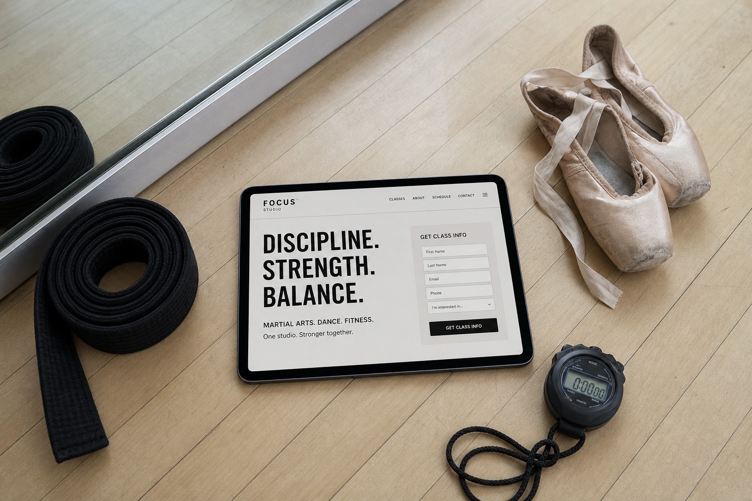
- Don’t post schedules and pricing publicly. Trade information instead — the prospect gives you name, email, phone, and class of interest, and you give them the schedule and pricing.
- If you’re not measuring, you’re guessing. Leads, form fills, calls, and source data tell you the truth that opinions can’t.
Why “I love how it looks” is the wrong success metric
Here’s the trap. You’re the least typical visitor to your own website. You already know your programs, your instructors, your schedule, and your philosophy. So when you look at your site, you’re evaluating taste.
The mom searching “kids karate near me” at 9:40pm on a Tuesday isn’t evaluating taste. She’s scanning for three things: Do you teach kids my child’s age? Are you close to me? What do I do next? If she can’t answer all three within about fifteen seconds, she leaves — no matter how gorgeous the hero animation was.
Design gets people to stay. Performance gets people to act. You need both, in that order — and most studio sites stop after the first one.
The same is true in dance. A parent comparing three studios for a 6-year-old’s first ballet class isn’t grading your typography. She’s trying to figure out whether you have a beginner class for her daughter’s age group and how to talk to a human about it.
What “performance” actually means for a studio website
Performance isn’t a vague technical word. For a martial arts or dance studio, it breaks down into a handful of measurable things.
1. Conversion rate
Of everyone who lands on your site, what percentage fills out a form or calls? This is the single number that matters most. Doubling your conversion rate has the same effect as doubling your traffic — and it’s usually far cheaper to fix.
2. Load speed
Every extra second of load time costs you visitors, especially on mobile data. Full-screen background videos, uncompressed photo galleries, and a stack of third-party plugins are the usual culprits. If your site takes five seconds to appear, a meaningful chunk of your traffic never sees your beautiful design at all.
3. Clarity of the next step
How many clicks from the homepage to “I’ve given you my contact information”? It should be one. A single, obvious, repeated call to action beats six competing ones. When everything is emphasized, nothing is.
4. Findability
A site that converts brilliantly but nobody can find still won’t grow your school. That’s where search engine optimization and, increasingly, answer engine optimization come in — being the studio that Google and AI assistants surface when someone asks for classes in your town.
5. Follow-up speed
The website is only the handoff. If a lead comes in at 9:40pm and nobody responds until Thursday afternoon, the site did its job and your process lost the student. Automated instant replies through email and SMS and organized lead management close that gap.
The design decisions that quietly kill conversions
Some of the most common “upgrades” studio owners ask for are the very things that suppress leads:
- A giant video header with no call to action. Impressive, slow, and it pushes your form below the fold.
- A crowded navigation menu. Twelve menu items feels thorough to you and overwhelming to a first-time visitor. Cut it down to the paths that lead to a trial.
- Clever button copy. “Begin Your Journey” performs worse than “Get Class Info.” Clarity beats cleverness every time.
- Publicly posted schedules and price lists. This one feels helpful. In practice it lets prospects self-disqualify on price and time without ever talking to you — and you never learn who they were.
- Long paragraphs about your lineage or artistic philosophy on the homepage. It matters deeply, and it belongs on your About page, not in front of a stranger’s first decision.
Why hiding schedules and pricing improves performance
This is the one that surprises owners most, so it’s worth a closer look. Publishing your full schedule and rates turns your website into a vending machine: prospects browse, judge, and leave silently. You get no name, no email, no chance to explain why your program is worth it.
The information-exchange model works differently. The visitor provides their name, email, phone number, and the class they’re interested in. In return, they get the schedule and pricing for exactly that program — plus a real conversation with your team. You’ve turned an anonymous visitor into a lead you can actually follow up with, and you get to sell value before you quote a number. Across more than a thousand studio websites over the past decade, this approach consistently outperforms publishing everything openly.
Does this mean design doesn’t matter?
Not at all. Design absolutely matters — it’s how you earn trust in the first two seconds. Parents make snap judgments about safety, professionalism, and quality based on how your site looks. An outdated, cluttered, or broken-looking site tells them your studio might be the same.
The point is that design is in service of performance, not a substitute for it. Great studio web design uses visual hierarchy to guide the eye to the form. It uses real photos of your actual students to build trust. It uses whitespace so the call to action can breathe. That’s what good martial arts website design and dance website design should be doing.
Ask of every design choice: does this make it easier or harder for a stranger to raise their hand?
A simple way to audit your own site this week
- Open your site on your phone using cellular data, not your studio Wi-Fi. Count the seconds until it’s usable.
- Start a five-second timer and ask a friend who doesn’t know your studio: what does this business do, who is it for, and what should you do next?
- Count the clicks from your homepage to a submitted lead form. If it’s more than two, simplify.
- Check your last 30 days of leads. How many came from the website? If you don’t know, that’s the first problem to fix — reporting should tell you where every lead came from.
- Time your follow-up. Submit a test inquiry yourself and see how long it takes your studio to respond.
How Market Muscles thinks about studio websites
We build websites for martial arts and dance studios with one question in front of every decision: will this produce more leads? That means fast, clean design paired with the conversion mechanics behind it — clear calls to action, information-exchange lead forms, an AI chatbot to catch after-hours visitors, automated follow-up, and reputation management so your reviews back up the promise your site makes.
Beautiful is the baseline, not the goal. The goal is a full schedule of students who found you, trusted you, and walked in.
FAQs about your website’s purpose
What is the main purpose of a martial arts or dance studio website?
To convert visitors into leads. Everything else — showcasing your instructors, telling your story, sharing photos — supports that goal. If your website isn’t generating inquiries you can follow up on, it isn’t doing its job regardless of how it looks.
How do I know if my website is performing well?
Track three numbers: monthly visitors, monthly leads from the website, and the conversion rate between them. Then track how many of those leads become trials and enrolled students. Without those numbers you’re relying on opinion.
Should I put my class schedule and pricing on my website?
No. Use an information exchange instead: the prospect submits their name, email, phone, and class of interest, and you send them the schedule and pricing for that program. It converts anonymous browsers into leads you can actually contact and lets you sell your value before price becomes the deciding factor.
Is a redesign always the answer when leads are low?
Not always. Often the bigger wins are simplifying the navigation, tightening the call to action, speeding up the page, and fixing follow-up. Audit performance first — a redesign that keeps the same weak conversion structure just gives you a prettier version of the same problem.
How fast should my website load?
Aim for under three seconds on a mobile connection. Compressing images, removing unnecessary plugins, and cutting oversized video headers are usually the fastest fixes.
How quickly should I follow up with a website lead?
Within minutes if you can. Automated instant text and email replies buy you time and keep the prospect engaged until a human can reach out personally.
Stop grading your website on looks alone
Your website is the first employee a prospective student ever meets. It works every hour of every day, it never calls in sick, and it either brings you leads or it doesn’t. Design is how it dresses for the job. Performance is whether it does the job.
If you’re not sure which side of that line your site falls on, run the five-step audit above — or let us look at it with you. Book a demo and we’ll walk through exactly where your site is winning and where it’s leaking leads.
Ready to take the next step for your studio?
Book a free demo to see how Market Muscles can help you get more leads, streamline your day-to-day, and grow without the overwhelm. No pressure. Just real solutions built for studio owners like you.